
A brand founded by Sebastián Ospina, the best paraglider in Colombia. Based in Switzerland, it guides explorers from around the world to experience life through a new experience: transformative adventures.
Goals
Our main conceptual objective was to redefine the notion of "adrenaline adventure" to align it with Seb's philosophical approach to adventure. Adventure, for Seb, goes beyond just adrenaline-pumping moments; it is exciting, profound, and diverse. Infusing these elements into the visual identity was crucial to differentiate the brand and capture Seb's captivating essence.
Challenges
The challenge was to shift the conventional perception of adventure associated with adrenaline, extreme experiences, and madness. Finding a conceptual path that resonated with Seb's vision required a deep connection with him, his thoughts, and experiences.
Another challenge was striking the right balance between dynamism and color while maintaining a touch of neutrality and structure. We aimed to stand out from competitors with bland visuals, yet avoid going overboard.
Scope:
Brand Strategy
Brand Identity
Web Design
Location:
Zurich, Switzerland.
Year:
2023
My Role
Process Coordinator: I led a team of 4 people, ensuring consistency in the brand concept across the identity and website.
Brand Strategist: Structuring Seb's vision and ideas to develop the brand concept.
Designer: Collaborated with another graphic designer to develop the brand's visual identity.
UX and Copywriter: Worked closely with Seb to identify specific website needs and then created the site structure and all its content.
Brand Strategy
Seb passionately expressed that adventure goes beyond a few minutes of uncontrolled adrenaline rush. For him, it is about connecting and learning from the environment and oneself. Based on this, I focused the brand on how adventure transforms you.
Seb Adventures offers diverse experiences, traversing the elements (water, fire, earth, and air), stimulating the senses, creating unforgettable moments, and ultimately rewarding participants with inner transformation.
Overcoming fears, meeting new people and cultures, connecting with nature, and continuously learning something new. This is the essence of Seb Adventures: stimulating and transformative adventures on multiple levels.
Visual Identity
During our benchmark analysis, we noticed the need to use color and infuse dynamism to captivate the adventure niche. After all, isn't adventure all about lush green forests, laughter, emotions and unmatched experiences? that really deserves a good punch of vibrant colors!.
Nature holds a sacred place in Seb's heart. We based his visual identity on the four elements of nature, selecting colors related to each element and designing a symbol that could blend them to create a unique identity.
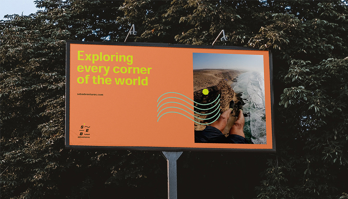
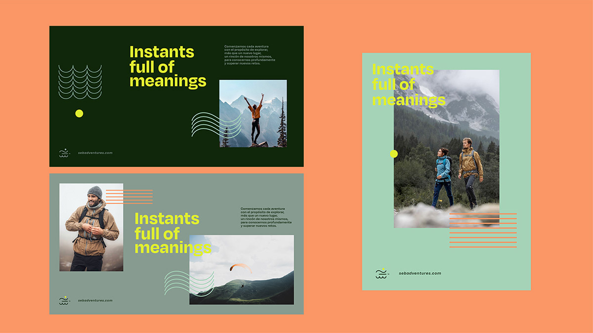
The result is a modern, dynamic, and versatile visual identity for Seb, filled with meaning and providing him with the tools to communicate and reinforce his vision daily.


The End of This Story?
We are currently working on the development of Seb Adventures' website, bringing the brand construction to the digital realm. Stay tuned for the upcoming process of this design phase! Bet you can't wait, huh?

CREDITS
Mark Design - Ricardo Cardona
Logotype - Ricardo Cardona & Manuela Gallego
Logotype, color palette & typefaces - Manuela Gallego
Direction and management of the Project - Manuela Gallego